

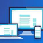
Making Your Design Responsive
With Mobile internet browsing and device conversion rate ever growing is has become essential for website owners to make their websites accessible from all devices. If your mobile visitors don’t have a positive experience when visiting your website or online shop, your driving away potential customers and huge portion of traffic that will potentially be going to competitors. This will also hurt your search engine optimisation of your website in the process.
Here are Five easy points to get you started on making your website mobile and device responsive.
1.Mobile Responsive
The idea of a responsive website to have all the same content and information available on a variety of platforms, making sure the format adapts to the appropriate device. This is a big part of website building as you must not limit your information to one platform as many other potential visitors will want to access it on a wide range of different platforms. All mobile responsive website designs are good for SEO as google prefer websites formatted for mobile viewing.
2.Easy Info
People generally browsing websites on their phones take time to read the content and information given, yet for viewers on the go they want to find what they are looking for as fast as possible. This is why it is goof to take in to consideration what information you are supplying and where you put it. The information that visitors on their mobile device want to see should appear right before them in the most eye catching and relevant place, ideally the start or beginning of the opening page e.g the home page. This content and information should consist of the customers most asked questions, try to supply the visitor with as much useful yet quick and easy information possible.
3.Avoid Flash
As flash is proven to be bad for SEO it hasn’t been very popular for last few years, as it can slow down a webpages loading speeds drastically and in some case on mobile and tablet devices not load at all, this point being proven by Apple and Android for not supporting flash at all. Therefore if you choose to use flash on your website you are essentially leaving your mobile visitors out. We suggest you forget flash all together as it as too many limiting features, the key is to find a solid Webdesign that works without it.
4.Button Size
When it comes to buttons on website for mobile device, size matters. On a desktop, laptop or any other device with a big screen and or mouse, its easy to click just about any button on a webpage. Yet when it comes to the awkwardness of trying to click a small button on a mobile device, it becomes quite problematic for the potential customer. The best way to save your customers the troublesome task of giving you money for a product you are selling, just simply use a bigger button, spaced evenly to cut out the frustration. Take some time yourself to test your buttons and make sure you don’t miss out on a sale due to smaller buttons.
5. Readability
Taking in to consideration that a viewer might be visiting your website via a smaller screen, its ideal to use a font size that can can adapt and be read easily, saving people time struggling looking for content and information. Along with size, font plays a key part in readability, try to stick to the more simpler font styles to avoid confusion and allow your visitors to not have to slow down their reading time with awkward complicated fonts.
Here to Help
If you have found these point helpful yet would like the support of a Web Design Professional in order to make your current website responsive or would like a new website built to respond to all devices, visit Faber Web Design.
 our customers.